
This metric lets us know traffic distribution throughout the week, but unlike power hours, it takes into account the average time spent in-store (together with the traffic received).
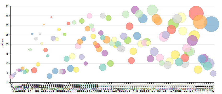
The y-axis represents the visitors per hour and the x-axis refers to Shoppermotion’s Window Index™, which combines the number of visitors, the length of their visit and the mobility throughout the store. How do we interpret this? Easy. Big circles indicate those moments during a week that accumulate more traffic and longer visits. Therefore, if we want to launch a campaign, we should take a look at the slots indicated by the bigger circles.