In a merchandise store, the speed and efficiency by which customers can access and move around is a critical aspect of the generation of revenue and the number of sales that are made. A customer who is able to find what they are looking for easily is more likely to spend some extra time and money on other products as against one that had difficulty finding the original product for which they are in the store. In this article, we will be picking the right store layout based on customer behavior.
By planning and optimizing a given space and floor plan for a store, retailers are able to maximize the travel time, accessibility, flexibility, and maneuverability of shoppers. The aim is to let the customer find what they want easily but at the same time engage them in such a way as to be placed in close proximity to items that complement or enhance their purchase.
But the choice of layout isn’t just affected by the size and area of the store but is also dependent on the items or products offered for sale. Various layouts have better results for certain products than others so this should also be factored in when selecting the appropriate layout for the store.
This report collects information for different layouts configuration by means of Shoppermotion, leader in-store retail analytics platform. By measuring thousands of customer journeys passively and anonymously, it is possible to create a behavioral model for each store configuration and benchmark different alternatives.
Types of store Layouts
Depending on the store, either a Grid, diagonal/Herringbone, Forced-Path, and Free-flow might be a better fit for its layout. Expansion managers and planners should examine all of their choices before concluding the design of their stores. Furthermore, picking the right store layout should be a customer-centric decision that includes an analysis of their behavior.
Grid Layout
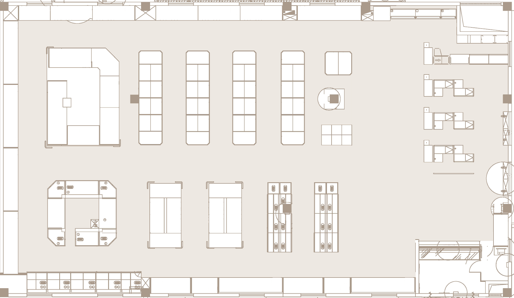
As the name suggests, this is a grid-like that has counters and fixtures placed in long rows or “runs,” usually at right angles, throughout the store creating clear aisles for traffic. If a store offers a large variety of good of different kinds then it is more practical to have a grid layout as shoppers are used to seeing such and with large enough aisle, shoppers can spend some time browsing the available options in any given category.
This is most often seen in supermarkets and pharmacies where customers are more likely to browse the entire store. There is a study concerning the importance of the main aisle of the supermarket.
Free-Form layout
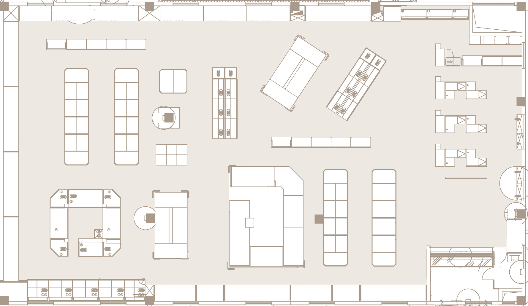
This is a non-structured layout design that can take any form, there is no defined traffic pattern, and it works best in small stores (under 500 square meters) in which customers wish to browse where merchandise is the same type, such as fashion apparel.
The customer is allowed to winder, change direction and backtrack all with ease because of the lack of restrictions, this has the added benefit of letting the customer glance or stumble upon an item they might be inclined to purchase.
Forced Path footprint
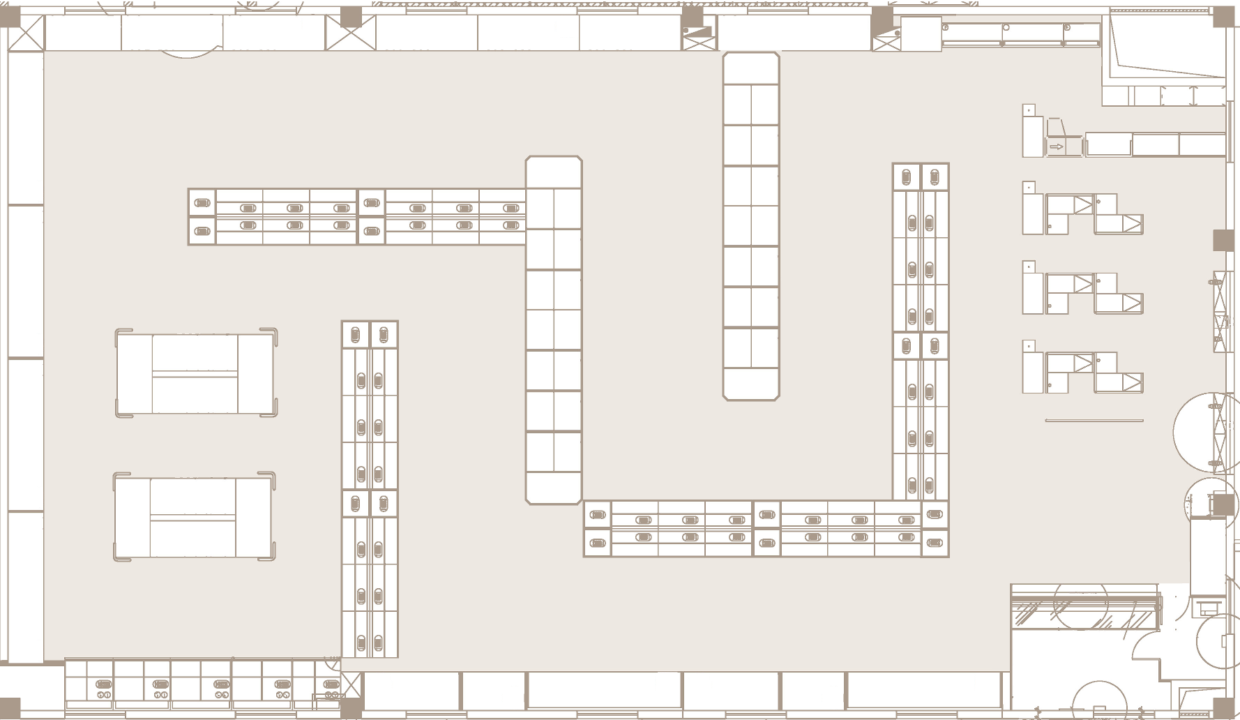
This is often called the mousetrap layout because it forces a customer to follow a predefined path from one point in the store to another while sticking through to a certain pattern. This layout is mono-directional and is seen in places like furniture stores such as IKEA or JYSK.
Customers wanting to experience a store and all its offerings are going to enjoy such a layout as they can spend their time going through each item one after the other without out having to select from a variety of paths, but on the downside, if a client or customer wishes to purchase just a single product within such a store, they might have to run the entire length of the store just for that singular product.
Herringbone / diagonal layouts
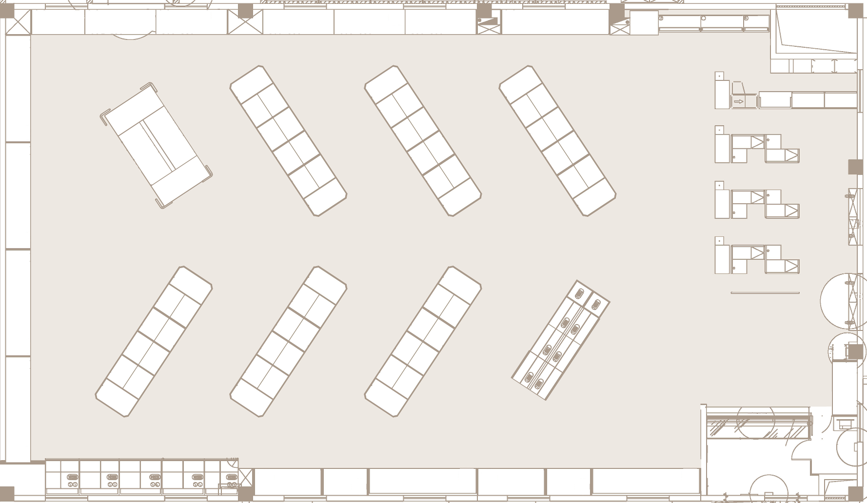
As known as a diagonal layout, this is very much similar to the grid layout with the exception that aisles do not run the full length of the store but have intermissions placed within. You get most of the advantages for a Grid layout while being able to be used in smaller spaces that might not be as long as that used in the grid layout.
This plan is perfect for self-service type locations and offers good visibility of the cashier or checkout point.
Technical analysis of the customer behavior
Even after selecting your desired layout, there are a few things to note that can determine the efficiency of your chosen plan. Given each floor design layout and the items on offer, we can determine if the selected layout is effective by analyzing the following data sets. Considering the customer behavior for picking the right store layout may become challenging, as there are many variables that we should take into account.
In this study, four indicators have been compared across the different layouts for a better understanding of their most noteworthy capabilities and features. By collecting thousands of journeys passively and anonymously, Shoppermotion enables retail managers to understand the behavior of their customers in their brick-and-mortars.
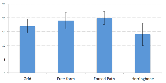
Visit duration
Simply put, this is the amount of time a customer spends in any part of the store from the moment they enter until their arrival at the checkouts area. Visit duration is calculated numerous times as the average journey duration per square meter so multiple footprints with different layouts and locations can be compared.
The Figure below collects the results of the visit duration in the different layouts. The longest journeys are performed by Forced Path (avg. 20 mins.) and Free-Form layouts (avg. 19.2 mins). Although Herringbone is the quickest layout, it also yields a higher variance due to its geometrical distribution, being able to perform in some circumstances longer than Grid layouts.
Number of sections visited
This metric can be calculated as the number of sections a customer dwells at to either look at the available products or selects an item for purchase. The value that determines that a customer has visited a category has been normalized for different layouts and area and it depends on the section, size, location, and walkable area.
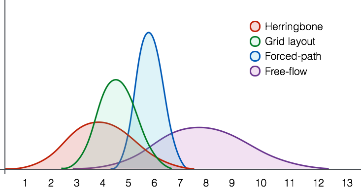
As seen in the above Figure, the Free-flow configuration achieves the maximum number of sections visited and also the largest variation. Other alternatives such as Forced-path and Grid Layout obtained lower values on average but more stable.
As expected, the variation of visited sections in forced-path and grid layouts are more steady as the path is easier and more explicit.
Number of stops during the path
Each customer has their own goals for visiting a store and will make a number of stops along the way either to take a look at an item that catches their interest or to select a product for purchase. This is measured as the number of stops during the journey to either look at the available products or selects an item for purchase. This value has been normalized for different layouts and categories.
The above Table collects all the information regarding this variable. Grid layouts commonly produce additional stops during the purchase that are associated with larger ticket sales. Furthermore, most of the traffic is produced in the mid and back of the store layout. Other alternatives such as the forced-path provide a smaller number of stops but more concentrated in the entrance of the store.
Herringbone model becomes helpful to stimulate quick purchases turning the main corridor as the backbone of the brick-and-mortar. In other studies, we have explored the importance of the store designs to improve in-store marketing campaigns.
Location of hotspots and heatmaps
This is a map of the store that showcases where the most activity within the store takes place, either by the number of visits that section has or the dwell time spent within a part of the store.
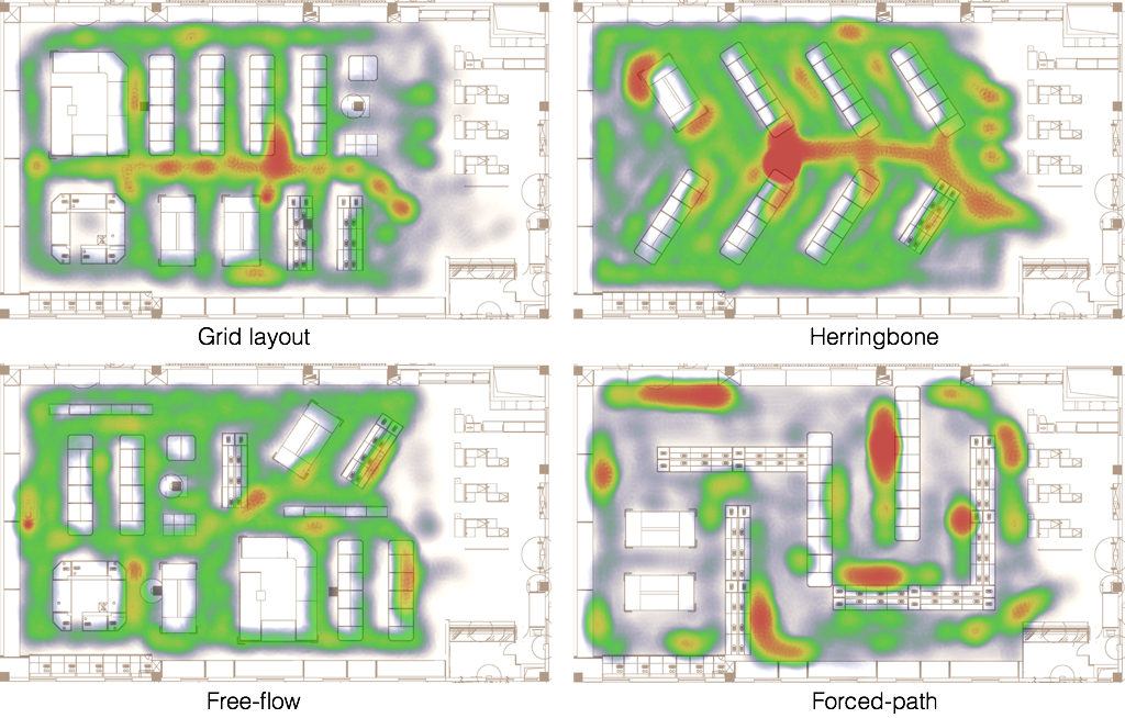
We can find the hotspots on different layouts and compare them in similar circumstances. Herringbone and grid layouts concentrate most of their traffic across the main aisle of the layout, driving a large impact on the endcaps and promotional islands near the main aisle.
Nonetheless, forced paths tend to create hotspots in visible areas and shelves positioned right in front of the pathway and ultimately, free flows distribute their hotspots homogeneously across the footprints.
Conclusions
From the data, we can see if and when certain spots within the store has a higher sales and traffic ratio than others, what items are promoted by the design and the difficulty customers have in getting to the most purchased items. Regarding the layout chosen, different variables will be augmented and therefore customers’ behaviors.
So we can conclude that having a good layout isn’t just about picking the one a retailer thinks is best in his given scenario but taking real-world data and making plans based on that. The goal will always remain to increase sales and create a satisfactory customer experience so they can come back again and again. And Picking the right store layout based on customer behavior will go a long way in making this happen.